Component based theme using UI-Patterns
UI Patterns can expose stand-alone theme components (patterns) to Drupal and enables them to be used with the core Layout and Views module and well-known contrib modules like Field Group, Display Suite and Panels.
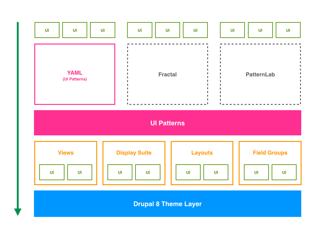
Here we explain how to create a component library, in a custom theme, by an example that includes two components:
Button OneParagraph One(includeButton One)
Requirements
The Drupal modules required are:
The following modules must be enabled:
- Display Suite (
ds) - UI Patterns (
ui_patterns) - UI Patterns Dsiplay Suite (
ui_patterns_ds) - UI Patterns Layout (
ui_patterns_layouts) - Ui Patterns Library (
ui_patterns_library)
Build component library
1. Create the components library
We must define our components library into the [THEME_NAME].info.yml of our theme:
component-libraries:
  atoms:
    paths:
      - components/atoms
  paragraphs_component:
    paths:
      - components/paragraphs
where atoms and paragraphs are the names of the component libraries we are defining, and in paths we define the folder that contains the components of the library.
Then we must create the folders of the paths defined above. So, inside our theme directory, create the folders:
- components/atoms
- components/paragraphs
2. Create the component button-one
A .ui_patterns.yml file is used to define the components provided by a theme or a module and expose them to Drupal. UI Patterns will use all .ui_patterns.yml files it finds in a theme’s or module’s directory structure, so it is possible to create component-specific files!
Let's create, inside our theme directory, the file [THEME_NAME].ui_patterns.yml with the following content to define the button-one component:
button_one:
  label: Button one
  description: A button template.
  fields:
    button_one_label:
      type: string
      label: Button label
      description: The label to print into the button.
      preview: Label
  use: '@atoms/buttons/button-one/button-one.html.twig'
We must now create the template file declared above. So, in our component library directory (component/atoms), let's create the folder buttons/button-one and create the file button-one.html.twig inside it.
3. Create the component paragraph-one
Let's add to [THEME_NAME].ui_patterns.yml the definition of paragraph-one component:
paragraph_one:
  label: Paragraph one
  description: A paragraph template.
  fields:
    image:
      type: image
      label: Image
      description: An image.
      preview: '<img src="http://lorempixel.com/640/480/nature/1/" title="An image" />'
    text:
      type: text
      label: Text
      description: A text.
      preview: Lorem ipsum dolor sit amet, consectetur adipiscing elit. Duis eget vulputate tellus, vel aliquam sapien. Donec convallis nibh eu volutpat egestas. Nullam enim metus, placerat eleifend condimentum id, sodales in arcu. Quisque vel lacus odio. Nullam vel massa quis lectus ullamcorper placerat. Cras at turpis nec nisl porttitor posuere quis et massa. Etiam mattis leo nec laoreet venenatis. Donec dictum nunc eget tristique molestie. Duis vel mi justo. Vivamus sagittis justo erat, eu tempor elit malesuada in. Praesent sem lorem, aliquet lobortis rhoncus sed, sagittis vitae nunc. Phasellus convallis dui a augue hendrerit, non scelerisque augue mollis. Vivamus congue, mi sit amet rhoncus finibus, nisi nisi posuere mi, id dictum nibh augue nec arcu.
    button_label:
      type: string
      label: Button label
      description: The label to print into the button.
      preview: Label
  use: '@paragraphs_component/paragraph-one/paragraph-one.html.twig'
We must now create the template file declared above. So, in our component library directory (component/paragraphs), let's create the folder paragraph-one and create the file paragraph-one.html.twig inside it.
4. Create the asset library for component button-one
We must define our asset library into the [THEME_NAME].libraries.yml of our theme:
button.one:
  version: 1.x
  css:
    component:
      components/atoms/buttons/button-one/button-one.css: {}
  js:
    components/atoms/buttons/button-one/button-one.js: {}
  dependencies:
    - core/jquery
    - core/jquery.once
    - core/jquery.ui.dialog
We must now create the asset files for button-one.css and button-one.js inside the theme directory declared above.
Finally, let's add the defined asset to the component button-one defined in [THEME_NAME].ui_patterns.yml adding the libraries parameter. So our component pattern definition must look like:
button_one:
  label: Button one
  description: A button template.
  fields:
    button_one_label:
      type: string
      label: Button label
      description: The label to print into the button.
      preview: Label
  libraries:
    - [THEME_NAME]/button.one
  use: '@atoms/buttons/button-one/button-one.html.twig'
5. Code for the component button-one
Let's add the code to the button-one component template button-one.html.twig:
<button class="btn-one" type="button">{{ button_one_label }}</button>
where {{ button_label }} is the variable declared in our component pattern.
Let's add the css code to button-one.css:
.btn-one {
  background: #666666;
  color: #ffffff;
  display: inline-block;
  padding: 5px 10px;
  border: none;
  margin: 10px 0;
}
Let's add the javascript to button-one.js:
(function($, Drupal, drupalSettings) {
  'use strict';

  Drupal.behaviors.buttonOne = {

    /**
     * Drupal attach behavior.
     */
    attach: function(context, settings) {
      $('.btn-one').once('btn-one-click').click(function() {
        $("<div>You clicked on button one!</div>").dialog();
      });
    }
  };

}(jQuery, Drupal, drupalSettings));
6. Code for the component paragraph-one
Let's add the code to the paragraph-one component template paragraph-one.html.twig:
<div class="paragraph-one">
  <div>{{ image }}</div>
  <div>{{ text }}</div>
  <div>{{ pattern('button_one', {button_one_label: button_label}) }}</div>
</div>
With {{ pattern('button_one', {button_one_label: button_label}) }} we are able to re-use the component pattern button-one to print the paragraph button.
7. Create the paragraph
First of all let's clean the Drupal cache to register the defined libraries:
drush cr
Now, from the Drupal UI, let's create the paragraph Paragraph Example One:
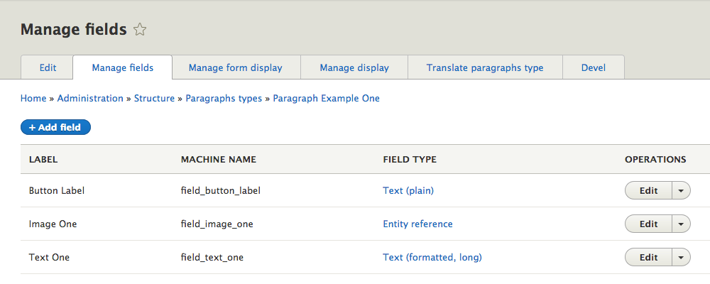
Let's associate to it the pattern Paragraph one we created:
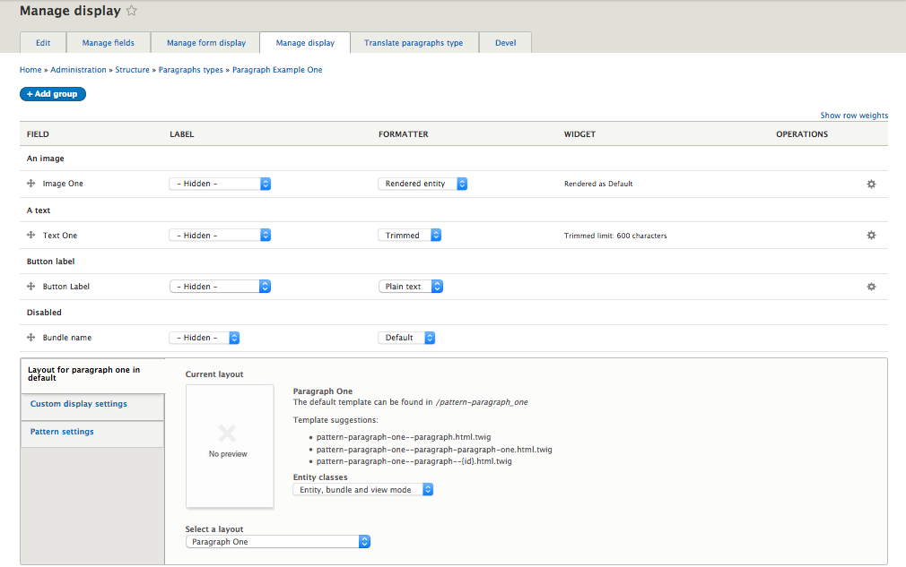
As you can see we associated the created pattern, in the Select a layout section (below the screen), and we mapped the paragraph fields to the pattern fields.
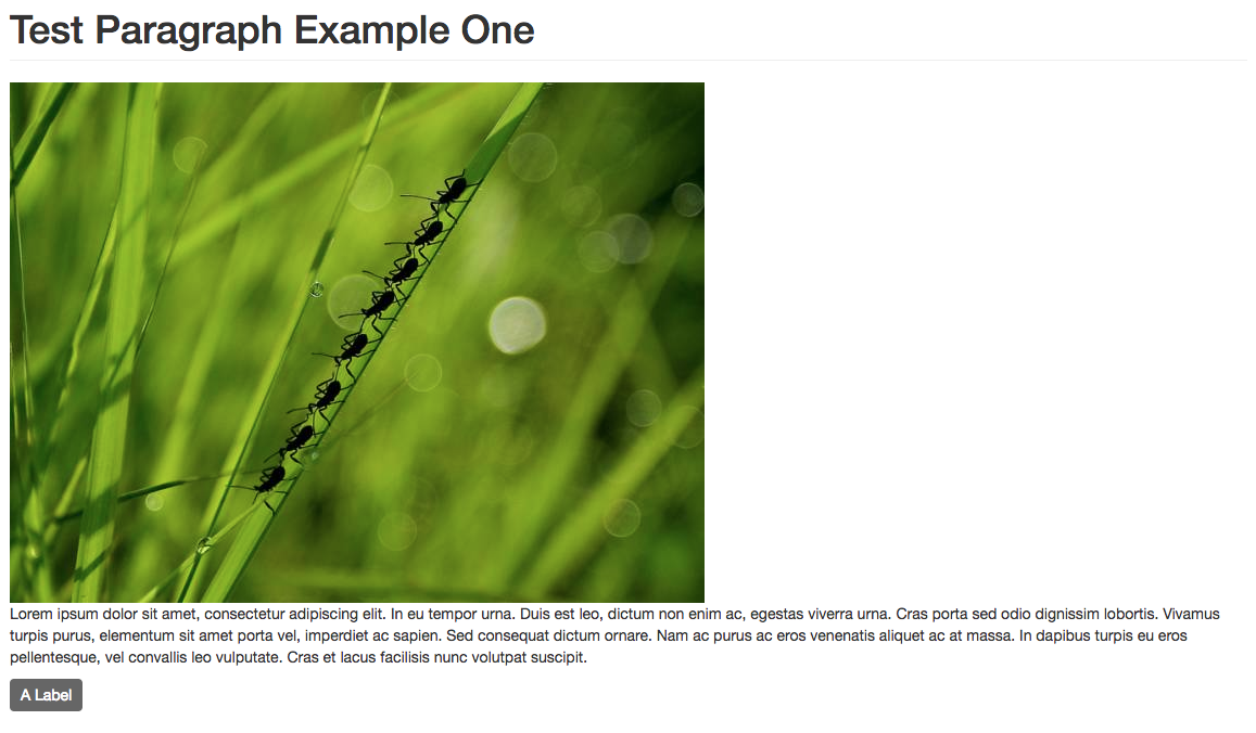
Finally we can create a content with the created paragraph that must look like:
Summary
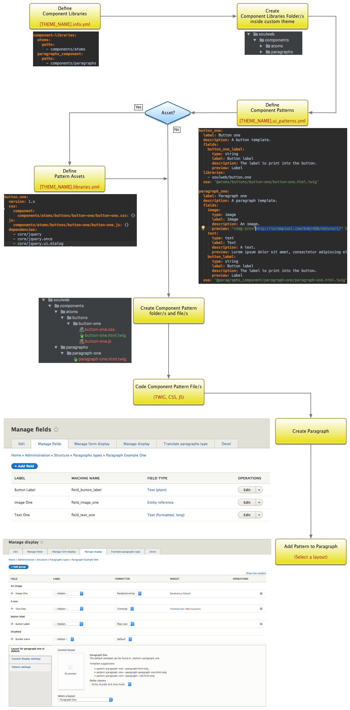
The whole process is summarized in the following diagram:
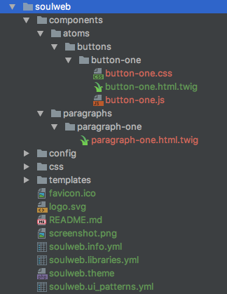
The finally theme structure must look like this:
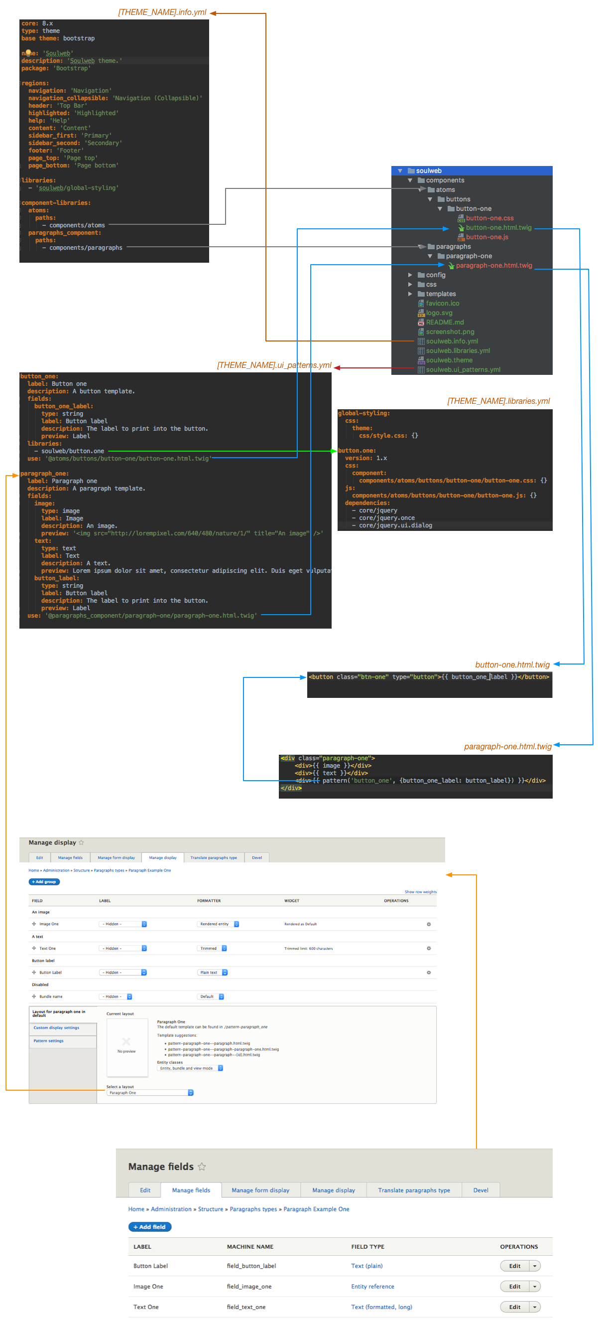
The whole structure is connected like in the following diagram:
References
UI Patterns showcase theme based on the Bootstrap Drupal 8 theme: